
.svg)


The most popular fonts in use today are Helvetica, Roboto, Times New Roman, Georgia, Comic Sans, Verdana, Arial, Garamond, Baskerville, Futura, Bodoni, and Rockwell. Below you'll find an example of each, who designed it and when, and what it's actually good for. Typeface choice does real work in a design, because it sets voice and controls whether your text is comfortable to read. It's one of the seven elements of design you'll use on every project. Typography also sits early on any UX design skill path, so it pays to know the common ones by name.
Key takeaways
- The 12 fonts below cover the four classifications you'll meet most: serif, sans serif, script, and slab serif.
- Helvetica, Arial, Verdana, and Roboto are the safe sans serif choices for screens.
- Garamond, Baskerville, and Bodoni are print-first faces. Bodoni's stroke contrast makes it poor for body copy.
- Georgia and Verdana were designed specifically for low-resolution screens, which is why they still hold up.
- Comic Sans is more legible than its reputation suggests, and it's still wrong for body copy.
The 12 most popular fonts at a glance
| Font | Classification | Year | Best used for |
|---|---|---|---|
| Helvetica | Grotesque sans serif | 1957 | Neutral branding, signage, anything that shouldn't editorialize |
| Roboto | Sans serif | 2011 | Android and web interfaces, long screen text |
| Times New Roman | Serif | 1931 | Print body copy, formal documents |
| Georgia | Serif | 1993 | Screen body copy where you want a print feel |
| Comic Sans | Script | 1994 | Informal notes, children's material, dyslexia-friendly text |
| Verdana | Sans serif | 1996 | Small sizes and low-resolution screens |
| Arial | Sans serif | 1982 | A safe default, preinstalled nearly everywhere |
| Garamond | Serif | 16th century | Books and long-form body text |
| Baskerville | Serif | 1750s | Refined print body text |
| Futura | Geometric sans serif | 1927 | Modernist branding, film titles, posters |
| Bodoni | Didone serif | Late 1700s | Titles, logos, book covers, not body copy |
| Rockwell | Slab serif | 1934 | Bold headlines with a warm, playful tone |
1. Helvetica: best for neutral branding and signage

Helvetica, originally Neue Haas Grotesk, is a sans-serif typeface developed in 1957 by Swiss type designer Max Miedinger. Post-war European companies were looking for a simpler, clearer typeface, drastically different from the decorative typography that came before.
Helvetica's distinctive form, characterized by clean lines, uniform stroke widths, and minimalistic shapes, is a hallmark of grotesque sans-serif typefaces. Its neutral, clear design works across a wide range of media, which is how it became one of the most widely used sans-serif typefaces of all time. Its most popular successors are Helvetica Neue and Helvetica Now.
The primary goal of this typeface is not to give an impression or carry any inherent meaning. That makes Helvetica one of the most adaptable typefaces for different design projects, from e-commerce to healthcare.
2. Roboto: best for screen interfaces and long text
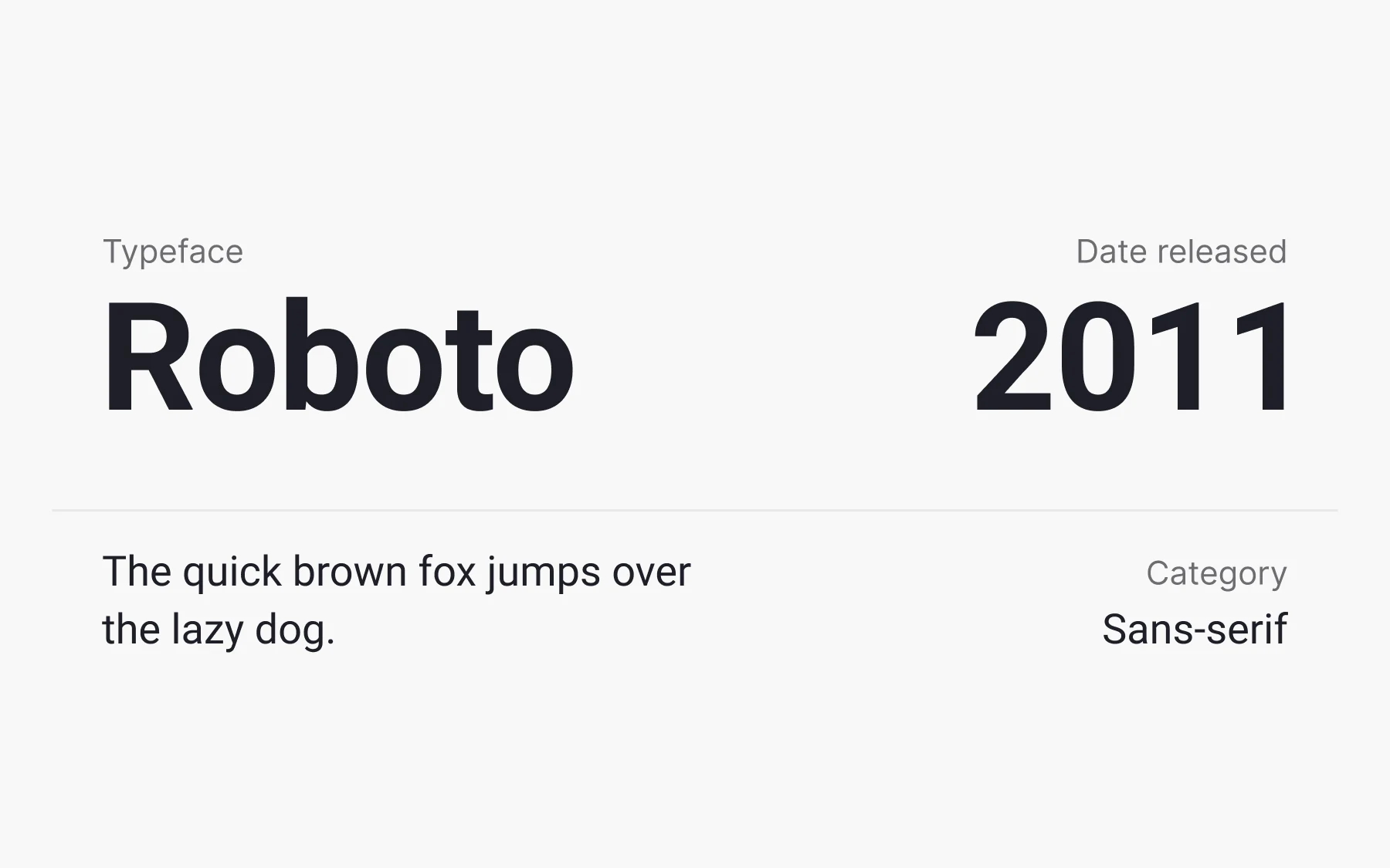
Roboto is a sans-serif typeface created in 2011 by American type designer Christian Robertson for Google. Initially designed for Android, it soon spread to other major Google products such as Google Play, YouTube, and Google Maps. Roboto is also a popular choice for website design thanks to its clarity.
Reasons to use Roboto:
- It keeps a balance between modern and classic, elegant and simple
- It improves legibility at small sizes
- It ships with Latin, Greek, and Cyrillic characters and a broad range of weights
3. Times New Roman: best for print body copy

You'll probably recognize this typeface immediately. Installed on nearly every desktop computer, Times New Roman has become one of the most popular typefaces of all time.
This serif typeface was created in 1931 by English typographer Stanley Morison for the British newspaper The Times. It was chosen to tighten newspaper page layouts, making efficient use of space and improving readability through careful text positioning and alignment. The typeface was hugely popular in print because its narrow styling fit more words on a line. In digital typography, designers tend to use it cautiously and reach for more up-to-date options.
4. Georgia: best for a print feel on screen
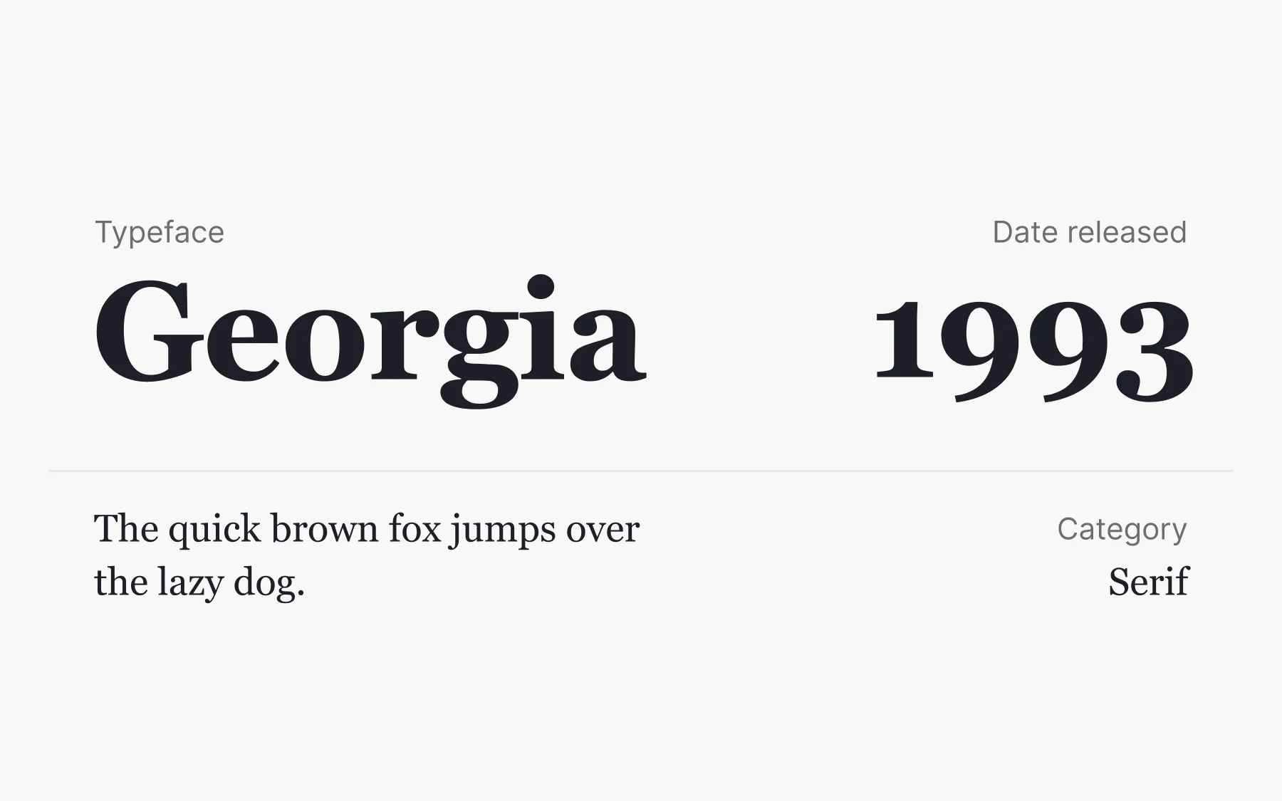
Unlike many other typefaces, Georgia didn't fall out of fashion. This serif typeface was created in 1993 by American designer Matthew Carter for Microsoft, with a mission to be elegant and legible even on small or low-resolution screens.
Carter improved legibility by enlarging the x-height, introducing clear outlines, and increasing character pitch. Georgia also uses proportional spacing, which adds to its clarity on digital screens. Media outlets including the New York Times and Huffington Post have relied on Georgia to keep the feel of a paper newspaper on screen.
5. Comic Sans: best for informal and children's material

Comic Sans MS is a script typeface created in 1994 by American designer Vincent Connare for Microsoft. It draws on comic book lettering and looks like it was written by a child. Each letter mimics the playful, informal style of hand-drawn script.
For better or worse, the typeface became a target of criticism and even hatred for its misuse and exaggerated simplicity. As Connare put it himself: "If you love it, you don't know much about typography, [but] if you hate it, you really don't know much about typography either, and you should get another hobby."
When is it okay to use Comic Sans? Its comic styling helps in informal documents and children's materials, but avoid it for body copy. The typeface also turned out to be highly legible, and it works well for readers with dyslexia.
6. Verdana: best for small sizes and low-resolution screens

Georgia's sibling, Verdana, is a sans-serif typeface created in 1996 by the same designer, Matthew Carter, for Microsoft. As with Georgia, the aim was a typeface that stayed legible on the low-resolution screens of the period.
If legibility is the priority, serif-free Verdana is a strong fit. It has an enlarged x-height and large counters, meaning the negative spaces inside letters such as p, c, a, R, and o. Verdana also carries more space between letters, which helps readability at small sizes.
7. Arial: best as a safe, preinstalled default

If you look around, Arial is everywhere. You can spot it in ads, branding materials, logos, newspapers, and magazines, not to mention websites and applications.
Arial is a sans-serif typeface created in 1982 by American company Monotype Imaging. It's similar in appearance to Helvetica and comes preinstalled on most devices. Arial is an adaptable typeface with good legibility, and it's a reasonable go-to if you're starting out. For more distinctive work, though, you should dig deeper.
8. Garamond: best for books and long body text

Garamond is a group of serif typefaces initially created in the 16th century by French engraver Claude Garamond. He had a talent for calligraphic-style typefaces that also suited the printing press.
Garamond's elegant capitals recall classical Roman inscriptions, reflecting the influence of ancient stone engraving. The Garamond typefaces have seen many revivals and have long been a favorite for books and body text. The original Google logo used Garamond. Adobe Garamond is one of the first digitized versions, and you may meet it reading novels.
9. Baskerville: best for refined print body text
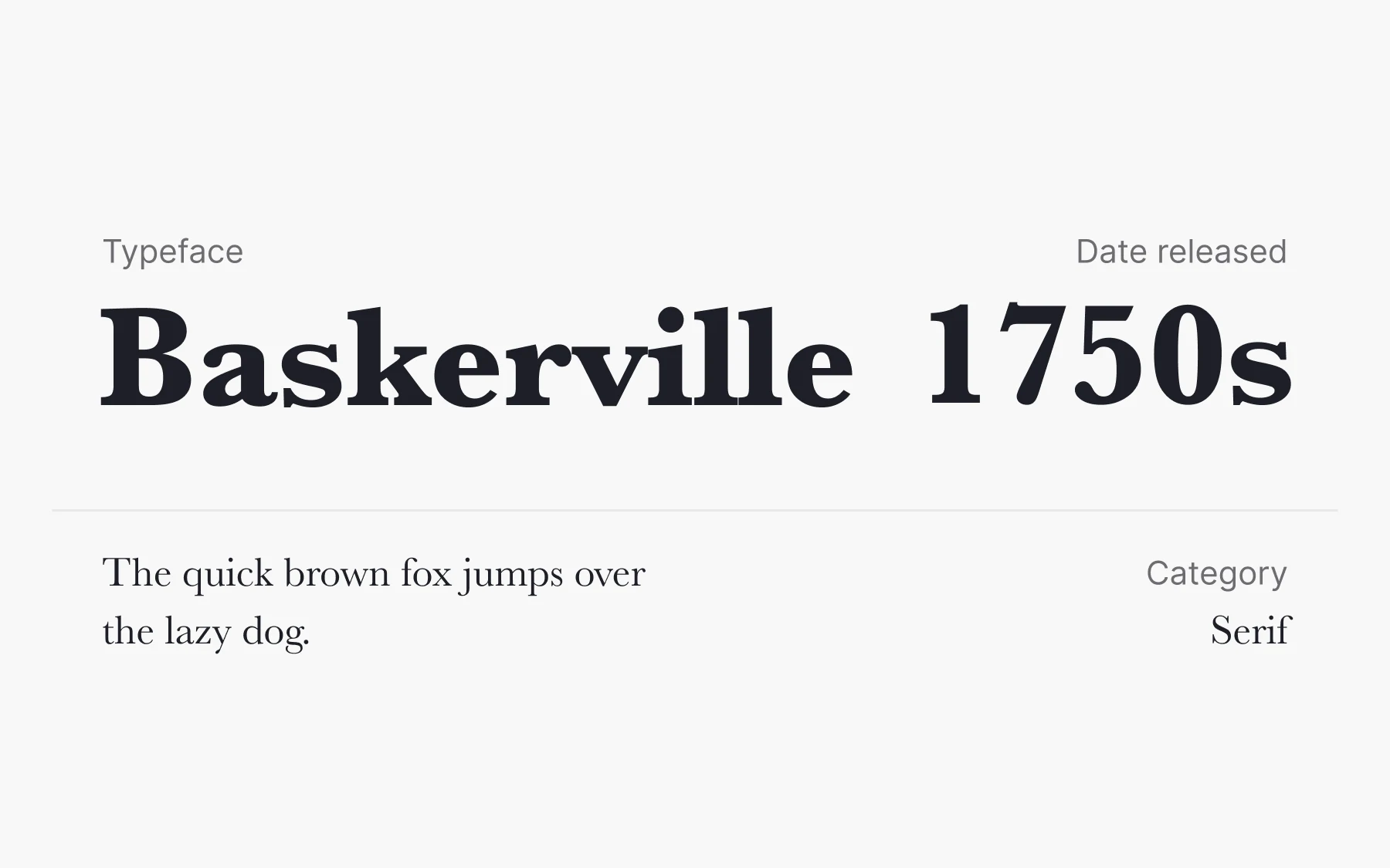
Baskerville is a serif typeface created in the 1750s by English designer John Baskerville. It was a genuine departure for its time, increasing the contrast between thick and thin strokes and carrying a stronger personality through its rounded strokes.
Baskerville is a prime example of serif letterforms that evolved from stone carving, where the serifs came from the chiseling process rather than from pure aesthetics. It took a large leap from old-style typefaces such as Caslon toward modern faces such as Didot and Bodoni. Ahead of its time, the typeface didn't gain much glory during Baskerville's life. Today it's one of the most refined and legible classic typefaces for print.
10. Futura: best for modernist branding and posters
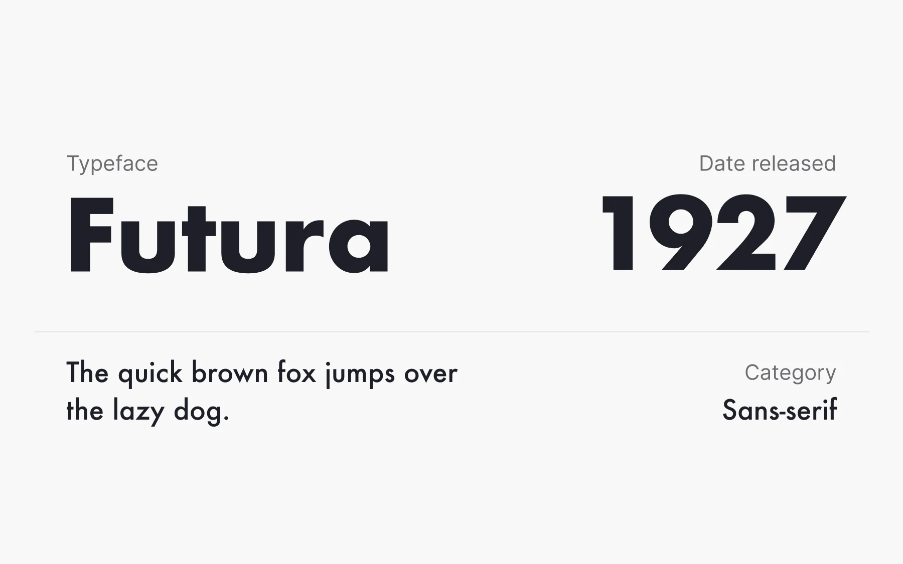
Inspired by the Bauhaus design philosophy, German designer Paul Renner created Futura, a geometric sans-serif typeface stripped of unnecessary serifs and frills. It represents a belief in functionality over ornament.
Futura's letterforms are notably squarish, which gives the typeface a geometric, modern appearance. Because of that simplicity, Futura was Stanley Kubrick's favorite, and he used it religiously across films including 2001: A Space Odyssey and Eyes Wide Shut. It also became the first typeface on the Moon. In July 1969 the Apollo 11 crew left a memorial plate set in Futura to record the first humans to set foot there.
11. Bodoni: best for titles, logos, and book covers
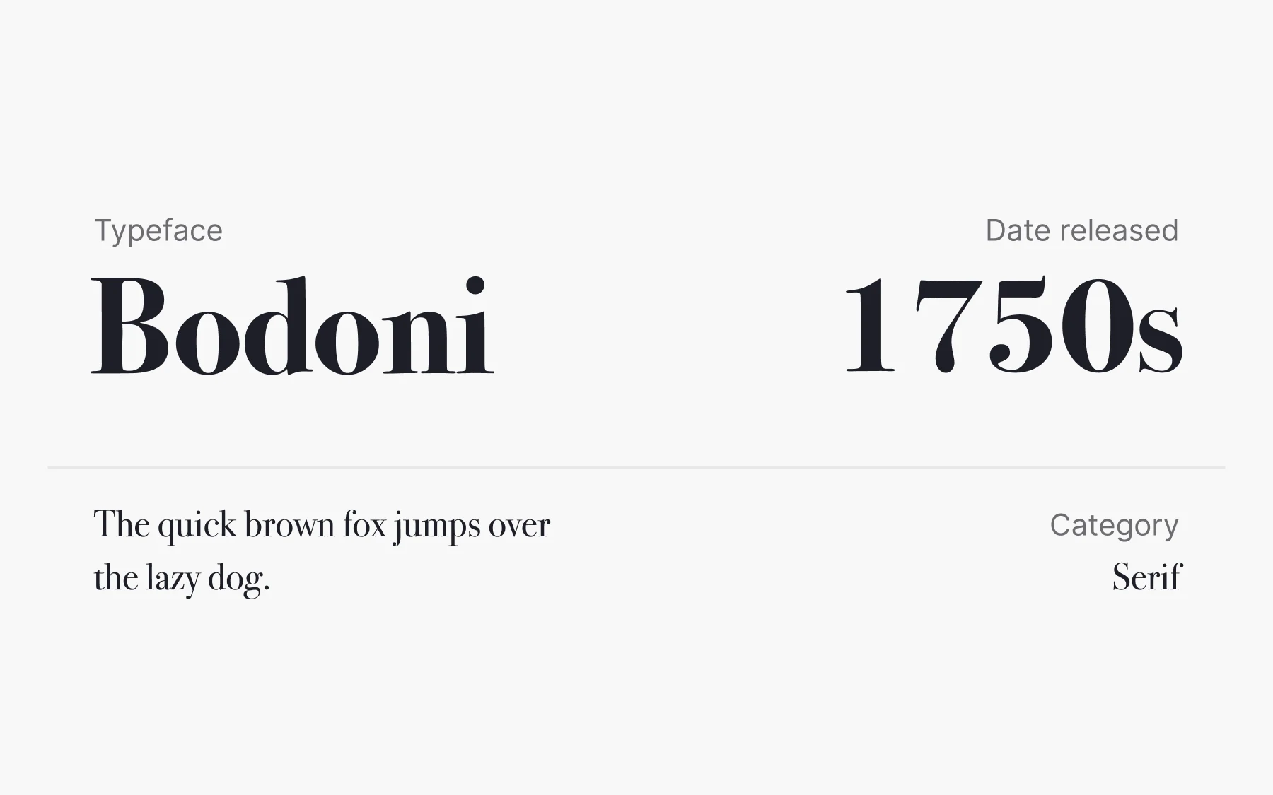
Bodoni is a serif typeface created by Italian typographer Giambattista Bodoni in the late eighteenth century. There have been numerous revivals since, and the two most successful are ATF Bodoni and Bauer Bodoni.
Bodoni produces a striking visual effect through high contrast between thick vertical and thin horizontal strokes, a hallmark of Didone typefaces. Those alternating strokes can make it hard to read at length, so avoid it for large paragraphs. Its refined, elegant style suits print work such as book covers and advertising, plus titles and logos in web design.
12. Rockwell: best for bold, warm headlines

An updated version of 1910's Litho Antique, Rockwell was released in 1934 by American company Monotype Imaging. It became one of the most popular geometric slab-serif typefaces, constructed almost entirely from straight lines, perfect circles, and sharp angles.
Slab-serif typefaces like Rockwell appeared at the beginning of the 19th century to meet demand for attention-grabbing display faces used at large sizes. Rockwell's block structure contrasts with the narrow styles of earlier typefaces, and its bold, almost drawn appearance makes it good for impactful headlines.
That blockiness and sharpness make Rockwell better for headlines than body copy. It can also create a warm, friendly, or playful feeling. Malibu Rum uses it to suggest a beachy, carefree mood.
How typeface classifications work
The 12 fonts above fall into four groups you'll meet constantly:
- Serif. Small strokes at the ends of letters, plus a visible shift between thick and thin. Garamond, Baskerville, Times New Roman, Georgia, and Bodoni.
- Sans serif. No serifs, usually more even stroke widths. Helvetica, Arial, Verdana, Roboto, and Futura.
- Script. Designed to look handwritten. Comic Sans.
- Slab serif. Thick, blocky serifs built for display sizes. Rockwell.
Classification systems go much deeper than this, with frameworks like Vox-ATypI grouping faces by period and form. If you want the full picture of how typefaces and fonts differ, start with typeface and font basics. From there, the typeface classification lesson walks through how the families break down.
How to choose a font for your project
Pick for the job, not for novelty. Three questions get you most of the way there.
Where will it be read? Screens reward large x-heights and open counters, which is why Georgia, Verdana, and Roboto hold up. Print tolerates finer detail, so Garamond and Baskerville shine there.
How much text is there? Long body copy needs a face that disappears. High-contrast faces like Bodoni and blocky ones like Rockwell tire the eye at length, so keep them for headlines.
What should it sound like? Helvetica and Arial say almost nothing on purpose. Futura sounds modernist and deliberate. Comic Sans sounds informal whether you want it to or not.
Two habits matter more than the specific choice. Limit yourself to two typefaces in a layout. Set line length so a reader's eye finds the next line without hunting. Both are covered in the typography course.
From Helvetica to Garamond, these fonts stayed popular because they solved a real problem well. Borrow the reasoning, not just the name.